Production basics
Why Your Second Production Run Never Quite Matches the First (And What to Do Before It Ships)
Fabric color mismatch between production runs kills reorders and triggers chargebacks. Here's exactly why it happens and how to prevent it.
Fabric color mismatch between production runs is one of the most frustrating problems a brand can face, and it's almost always preventable. The first run comes back looking right. The reorder, made from what looks like identical specs, ships in a shade that's half a step off. Your retail buyer notices. Sometimes the customer notices first. Either way, you're now having a conversation you didn't budget for, about a problem that started long before the fabric was cut.
This isn't a factory carelessness issue, at least not usually. It's a documentation and process issue. Understanding what actually causes colour variation between runs means you can specify your way around most of it before production ever starts.
Why colour matching between runs is harder than most brands expect
Most brands treat a Pantone number as a finished instruction. It isn't. A Pantone reference is a starting point. It tells a dyer roughly where to aim, but it doesn't control the dozens of variables that determine where the colour actually lands on a physical fabric.
Fabric is not a screen. What you see on a Pantone fan deck is ink on coated paper. What you get from a dye process is a chemical reaction between a dye molecule and a fibre. Those two things behave completely differently, and the gap between them is where colour problems live.
Dye lot variation is consistently one of the top five reasons U.S. retail buyers reject shipments or issue chargebacks against apparel vendors, particularly on reorders. The cruel irony is that most of these rejections happen on styles that sold well. You wouldn't be reordering if it hadn't worked. But the reorder is precisely when variation is most dangerous, because now there's a physical reference sitting in stores that the new goods have to match.
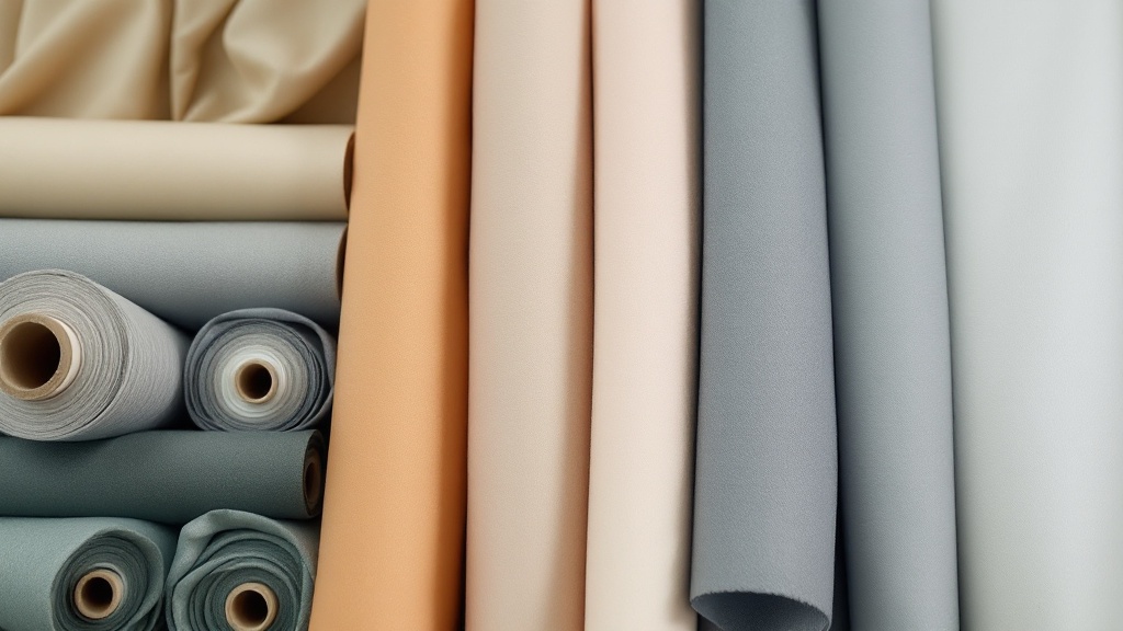
The five most common causes of dye lot variation at the factory level
These aren't exotic edge cases. They're the ordinary, everyday reasons colour drifts between runs.
- Different fabric rolls from different mill batches. Even fabric ordered to the same specification from the same mill can come from different production runs, meaning different raw fibre, different yarn twist, different pre-treatment. The specification is the same. The physical material is not.
- Water quality variation. Dyeing is water-intensive, and mineral content in water affects how dye bonds to fibre. A factory drawing from a different water source, or processing in a different season when water composition shifts, will see colour drift even with an identical dye formula.
- Dye concentration and mixing tolerances. Dye chemicals are mixed by weight, and small measurement variances compound. A half-percent drift in a dye component can produce a visible shade shift, particularly in saturated colours or neutrals where the eye is most sensitive.
- Temperature and time variation in the dye bath. Reactive dyes, which are the standard for cotton and many blends, are temperature-sensitive. If bath temperature runs high or processing time runs long, the colour deepens. Running short, it pulls lighter. A few degrees or a few minutes is all it takes.
- Finishing chemistry differences. Softeners, fixatives, and other post-dye treatments affect the final appearance of a colour. A run processed with a different softener formulation, or at a different concentration, can look noticeably different even if the dye lot is consistent.
What a lab dip is, why it matters, and why skipping it is a costly shortcut
A lab dip is a small sample of fabric, typically a few inches square, dyed to a target colour and submitted for approval before any bulk yardage is committed. The dye team works iteratively, adjusting the formula and resubmitting until the colour is within acceptable tolerance. Only then does bulk dyeing proceed.
It's not glamorous. It adds 5 to 10 days to a development timeline. Brands on tight deadlines routinely skip it, especially on reorders where they assume the factory already has the formula. That assumption is where reorder colour failures come from. Dye formulas are tied to specific fabric lots, specific dye batches, and specific processing conditions. None of those things are permanent.
The math on skipping lab dip is straightforward and not in your favour. A colour rejection caught at the lab dip stage costs you 5 to 10 days. A colour rejection caught after bulk production is complete typically requires a full remake, and remakes cost 30 to 60 percent of the original production value once you factor in wasted material, re-cutting, and expedited production. On a 500-unit run at $45 per unit, that's a potential $6,750 to $13,500 loss. The lab dip was free.
How fabric composition affects dye uptake, and why the same Pantone reference behaves differently on different substrates
Cotton and cotton-blend fabrics absorb reactive dyes differently depending on fibre origin, yarn twist, and pre-treatment. Ring-spun cotton from one origin will take the same reactive dye formula to a slightly different shade than open-end spun cotton from another. It's the same Pantone number. It's the same dye formula. But the fibre is different, and the result is different.
Polyester is a different category of problem entirely. Polyester requires disperse dyes processed at high temperature and pressure, typically above 250°F. The colour molecules are physically locked into the fibre during this process. And here's the critical point for anyone running polyester: if the colour is wrong, re-dyeing is not a practical option. Polyester cannot be stripped and re-dyed reliably once it's been processed. A colour failure on a polyester run is almost always a full fabric loss. There is no recovery. The financial risk of skipping lab dip approval on polyester is disproportionately high.
Blends compound everything. A 60/40 cotton-polyester blend dyes partly with reactive chemistry and partly with disperse chemistry, and the two dye types don't always land at the same rate. Getting a blend to a target colour requires calibrating both dye systems together, which is why blend fabrics almost always require more lab dip iterations than pure fibres.
The role of lighting conditions in approving colour: why office light and showroom light are not the same
Metamerism is the phenomenon where two colours appear to match under one light source but diverge under another. It happens because different dye formulas can produce the same apparent colour in one lighting condition while reflecting light differently at other wavelengths. Change the light, and the match falls apart.
The industry standard for colour evaluation is D65 daylight illumination, assessed in a calibrated colour evaluation booth using a spectrophotometer. That's not the fluorescent light in your office. It's not the incandescent lamp in your showroom. And it's definitely not the screen on your phone or laptop.
Brands that approve lab dips under non-standard lighting, and it happens constantly, are essentially signing off on a colour match that may not hold under retail or outdoor conditions. Your buyer's quality control team will evaluate incoming goods under D65 or a calibrated equivalent. If you approved under incandescent, you may have approved a mismatch without knowing it.
The fix is simple: use a lightbox. A proper D65 evaluation booth costs a few hundred dollars and eliminates one of the most common approval errors in apparel sourcing. If your factory doesn't have one, that's a conversation worth having before you start sampling.
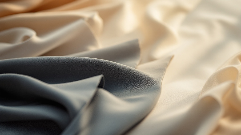
What brands need to include in their tech pack and trim card to give a factory a fighting chance at matching
A Pantone number in a tech pack is not a colour standard. It's a colour direction. There's a difference, and it matters at the production level.
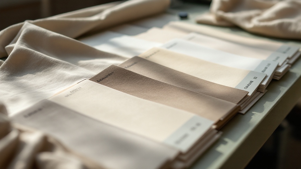
Brands that supply a physical trim card, an actual swatch of fabric dyed to the approved colour standard, consistently have lower colour rejection rates than those who reference only a Pantone number. A physical swatch gives the dye team something real to match. A Pantone chip gives them a target they can only approximate, because they're translating from coated paper to living fibre.
Here's what a complete colour specification package actually needs:
- The Pantone reference number, C or U coating specified (coated and uncoated chips are different colours, and the wrong one causes confusion).
- A physical fabric swatch dyed to the approved standard, labelled with the style number, colourway name, and approval date.
- The fabric content and construction of the approved swatch, because a match approved on 100% cotton doesn't automatically transfer to a cotton-poly blend.
- The acceptable tolerance, stated as a delta E value under D65 illumination.
- The lighting condition under which the standard was approved.
- Explicit instruction on whether the tolerance applies to lab dip approval only, or to bulk production as well.
That last point catches people off guard. Lab dip approval and bulk production colour are two different checkpoints. Some brands approve lab dips at dE 1.0 but accept bulk at dE 1.5. Some hold both to the same standard. The factory needs to know which it is before bulk dyeing starts, not after.
How colour tolerances work, what a delta E value means in practice, and what range is acceptable for production
Delta E, often written dE or ΔE, is a numerical measure of the difference between two colours as measured by a spectrophotometer. A dE of 0 means the colours are identical under measurement. The higher the number, the larger the difference.
The standard in most professional apparel production is a dE of 1.0 or less under D65 daylight illumination. Anything above dE 2.0 is typically visible to the human eye under normal viewing conditions. Most retail buyers will reject at dE 1.5 or higher, and some major retailers hold to dE 0.8 on critical colourways.
Where this gets complicated in practice is that dE is an average across multiple colour dimensions, and some colours are more sensitive than others. A dE of 1.2 on a bright primary red might be imperceptible. The same dE on a greyed taupe or an off-white may be clearly visible. The tolerance number alone doesn't tell the full story. What colour you're trying to hit matters as much as the gap.
What happens when colour is rejected after production: who pays, and how nearshore lead times change the damage calculation
When finished goods fail colour evaluation, someone has to pay for the mistake. If the factory deviated from an approved lab dip without notifying the brand, the factory typically bears the cost of the remake. If the brand approved a lab dip that was already out of tolerance, or approved under wrong lighting conditions, or failed to supply a proper colour standard, the liability calculation gets complicated fast.
But regardless of who's financially liable, the practical problem is the same: goods that can't ship. And that's where lead time becomes the real cost driver.
Brands sourcing from distant origins often discover colour mismatches only after goods have already shipped, sometimes weeks after they left the factory. By the time the shipment arrives and fails QC, the lead time to remake is another 12 to 16 weeks. For a spring delivery or a holiday reorder, that window is simply gone. You're not remaking for the season. You're remaking for the next one, if you can afford to.
With a 4 to 6 week production lead time, the equation is different. A colour rejection caught before shipping, even one that requires a full fabric change and re-cut, can be corrected and reshipped within a window that still meets most U.S. retail floor dates. That's not theoretical. We've turned around colour corrections in under three weeks when the issue was caught early and the replacement fabric was in stock. That kind of recovery is simply not achievable from a production origin four times further away.
The honest answer to who pays is: it depends on your documentation. Brands with complete colour standards, approved lab dips, documented tolerances, and calibrated approval processes have clear grounds to demand a factory remake at no cost when colour fails. Brands with a Pantone number in a tech pack and a verbal approval over email are in a much weaker position, regardless of where their factory is located.
Get the documentation right before production starts. Approve lab dips under the correct light. Specify tolerance in writing. Keep physical swatches from every approved run, labelled and dated. Those swatches are your insurance policy for every reorder that follows.
If you're planning a reorder and want to know whether your colour documentation is strong enough to prevent a rejection, send your tech pack and trim card to Procesarte and we'll tell you exactly where the gaps are before production starts.
Get a quote